
“I want my website to bring in leads”… “I’m getting a lot of traffic to my page but I’ve only sold 3 homes so far this year”…
Does this sound familiar?
The main goal we hear from customers at RealtyNinja when planning a new website is that the site should be setting you up for success by capturing leads and getting you showing requests. If you have a website, people will use it, right?
Kind of.
These days, real estate agents really have to show people the value in what you provide. The person viewing your website may have already seen 5 other sites from the same neighbourhood. What’s going to make them stop on yours and think, “I’m going to take the next step here, give this agent my precious information, and ask for their assistance”?
The answer is calls-to-action. Or as we refer to them in the industry, “CTA”s.

What is a CTA?
A call to action is a short, few-word sentence that inspires consumers to take action.
Some common ones you’ll see across the net include “Learn more”, “See more”, “View all”, and “Contact us”. These are so generic, they work in a pinch because people usually understand what they’ll lead to simply from seeing them everywhere.
Calls to action are important on a website because they are essentially the trigger to a visitor doing something on your website. If your CTAs are too vague and visitors don’t know what’s going to happen when they press that button, fear of the unknown sets in and the button doesn’t get pressed.
Good user experience practice dictates that you should provide a sneak peek or “window” into what that person can expect after the button is pressed. Once they know what will happen (and if it’s an agreeable action), the likelihood of following through increases.
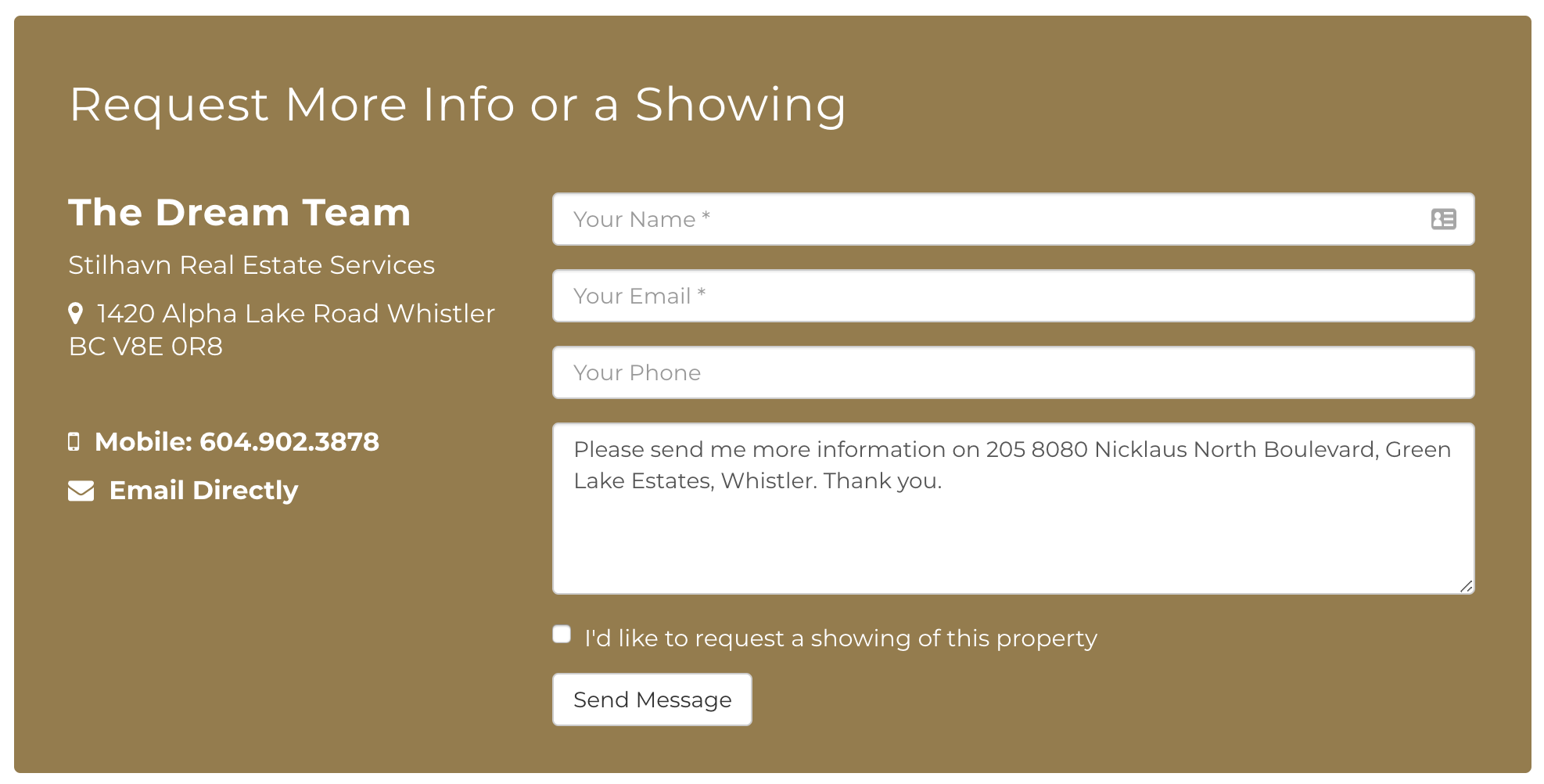
This is why instead of the generic “Submit”, contact forms on a RealtyNinja website say “Send message” – it’s more human and anyone can recognize that what they’ve just entered will be sent to the website’s owner. Hopefully, they have also gotten to know that owner over the course of their website stay (or from external knowledge) so there is already a level of trust assigned to you – one less barrier!
How much is too much?
Is it enough to simply make sure that you’re saying the right thing? Actually, equally important is when you say it.
For example, let’s say that on your website you have a 3-slide banner (each with their own CTA button); Then an intro section below the banner in which you link to your bio. Then 3 different calls to action for buying, selling, and contact information. Followed by some listings, and a general contact form.
Between all these sections, there are 8 different options you’re asking someone to choose from. The usual reasoning behind doing so is: “I want to give the person using this website every option available that they might be looking for.”
The reasoning is sound until you understand how easily distracted your website visitors are. As humans, we simply don’t have (or perceive to have) enough time when viewing something like a website to make one selection out of 8 options. Three possibilities at the most is generally a good rule – or get more persuasive by making one of them sound better than the rest!
Let’s take a moment and think about nursery rhymes and why they are so popular with children. They work well to educate because of one simple reason: repetition. Rhyming is just the repetition of a syllable, which makes it very easy for a child’s mind to remember that saying.

The same concept applies to your calls to action – in order to convince someone to do something, make the idea take root in their head. Plant that single seed. Then, follow up with a strong call to action that encourages them to make the jump. Especially true on landing pages with one main objective, it can be a good idea to include a couple of the same call to action throughout the same page instead of giving different ones each time.
#Relatable
Really, the call to action should be a simplified request based on what your website visitor has just read. It should be 3 words on average (depending on your brand’s voice – could be longer if you’re a bit cheeky) and leave no question as to what will happen or what benefit they will get from it. You may use supporting text to provide this information if it makes it stronger.
For example:
“Since 1999, I’ve helped thousands of people move into their dream home. When you work with me, you can rest assured that your real estate needs are understood, and will be catered to from start to finish. Don’t take my word for it though, my many awards and positive testimonials can back this up. Fill out the contact form to get directly in touch with me, and we can talk about your goals for the future. Let’s chat”
Here you’ve given them a little info (the personalized details about who you are), and then you’re inviting them to take action in the form of having a comfortable chat with you. There is no hesitation happening if that is the reader’s main motivating factor – someone who will listen to and understand their real estate goals.
Of course, sometimes the focus is just to lead people further into your website and describe the multiple ways you can help them. It may be helpful to make these calls to action more powerful and attention-catching through visuals. The most popular request we get during customizations is to do just that.

The reasoning behind providing visual calls to action is to give the viewer a subconscious picture attachment to the idea up for presentation. Once they see themselves in that place of benefit their hesitation is alleviated. If you’re showing that you have a page for first-time buyers’ resources, for example, using a photo of a younger professional or couple will attract that target audience’s view because it’s familiar to them. The photo should allude to what the target page is about as well, because then we take advantage of the saying “a picture says a thousand words.” We love to skim things on the internet, and providing related visuals helps us do that!
A Free Call to Action Bundle for REALTORS®
The RealtyNinja Design Team has thoughtfully crafted a new set of CTAs for any Realtor® to use. Just enter your email address in the form below and you’ll receive a .ZIP file containing several sets of photo CTAs to choose from.
Each set is a different style of branding, and there are different wordings and images in each one. Use the files wherever they fit best on your website, and link them to the appropriate pages! Based on our experience, the most commonly requested CTA buttons link to Buying resources, Selling resources, and Home Evaluation pages – you’ll find the bundle contains many of these buttons, but there are others mixed in as well!

One last tip to end this article: Don’t be afraid to use these call to actions (or CTAs in general) on other pages outside of your homepage! Invite people to learn how you can help buyers and sellers specifically on your about page. Include a text link on your MLS® Search pages to information on buying a house. On your selling page, maybe you have a separate resource or blog post you’d like to link to. If you think about what people might like to hear about in relation to what else is on that page, your site strategy becomes a lot more effective.