Back in Winnipeg, people LOVE getting a good deal. We are known for penny pinching with no shame. I even heard that high end brands will send all of their reductions to their Winnipeg branch because they know we love a low price.
When I was graduating from college, my instructors warned us that the same mentality would show up in our clients: People would want every little space filled up, thinking that would make them get “more bang for their buck”.
Since moving to Vancouver and working with more and more REALTORS®, I see a lot of logos that make me think they’re a fellow Winnipegger! Sometimes, all you need is your name or company name to be noticeable. Here are some tips on how to stand out.
ONE: YOUR DESIGNER
Inarguably one of the best ways to ensure a good logo, my first tip is this: Do not try to make your own logo. Many designers go through intense training in areas like psychology and business tactics to understand what makes people interested in visual ideas. Not only that, but they have skills in using the best programs out there to make a professional logo. If you are planning to put your logo onto anything, make sure it’s something you are proud of!
Pick a designer you trust. Don’t just go with the lowest price, or the one with the best portfolio. They may have the technical skill, but you need to be able to communicate effectively with them in order to get a brand that accurately describes you. You should also be able to trust them to make the design decisions that will bring your professional identity to the next level. If you disagree with them, you should at least be able to communicate your feelings and understand their reasonings.
TWO: THE LOGO

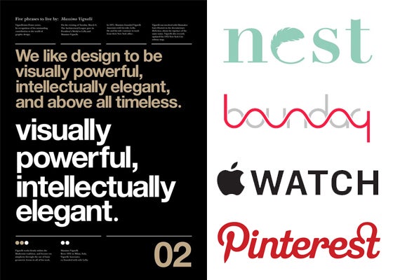
A logo is usually structured in two ways: the logotype, and the logomark.
You do not necessarily always need a logomark, but if you have a complicated or long name, you may find it easier to be recognized with one. A logotype may also be considered a logomark depending on its treatment, for example Coca-Cola.
Think about all of the different places you see logos. Billboards, bus ads, newspapers, phone screens. There is a huge difference in sizes there! Here are some ways your logo can maximize visibility in all of these:
- It should be easily recognizable. Sometimes people aren’t going to have more than 2 seconds to look at an ad. Make sure your logo stands out and can be quickly understood.
- It should utilize a unique colour scheme, but also be legible in black and white. If you run out of colour ink and home and need to print off one last letter, it should still look good!
- It should be scaleable. Can you still read or recognize it at 5mm wide? How about so big it covers your screen?
THREE: FINAL NOTES
To end with, here are a few extra tips. Firstly, don’t settle. It may help to write down a list of what you want your logo to do for you, and who you want to be interested in your logo. Be specific! This will also help your communication go easier with the designer.
Secondly, save everything you ever receive from the designer! Make a backup, too. If you ever need to use it somewhere and you need the logo file, send them the original designer’s files. You should also receive a style guide that lays out all of the branding decisions made: Fonts, colours, graphic elements, possible even inspiration.
If you were considering a rebrand (or need a logo to begin with), I hope this helps! Remember, don’t be a Winnipegger: sometimes you don’t need to include your headshot, middle names and tagline in your logo!
Let us know what you thought of this piece on our Facebook Page & Twitter