If you’ve ever wondered why you shouldn’t use Times New Roman on your site, why you can’t use Calibri as your main font choice (even though it works in your Microsoft Word documents), or even just generally what your options might be: this article is for you!
(If you are a designer, this may not be for you as I will use the terms font and typeface interchangeably and keep things very simple. I would advise you scroll to the end for easy typeface pairings.)

What the Font
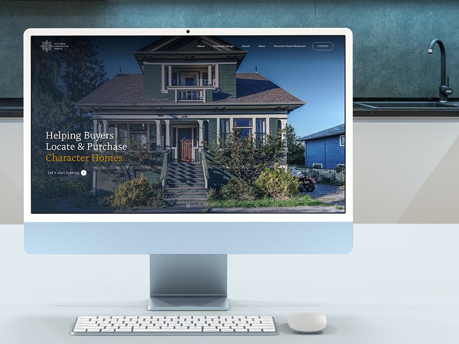
Typography is an important part of both the personality of your site, and the technical way your viewers actually read the content of your site. Choosing the right typefaces for your website should meet both of those reasons ― form and function ― which will help your site feel unique and of a higher quality than it would when using default options. When the personality of your site matches the personality of your brand, it boosts trust and makes for a more comfortable user experience… which companies and artists have been developing for centuries.

Although some form of “type design” has been around since humans started drawing on cave walls, the typography we are familiar with began in 1440 due to the invention of printing presses. The sharing of news and long-form stories called for text that made it easy to make out the shapes of each distinct letter and follow multiple sentences in a way that could be replicated over and over instead of hand-drawn each time.

Use cases for both hand-drawn and printed words grew with the rise of consumerism and the industrial revolution. Letters were explored in art, advertising on signs, and adopted as part of corporate identities. What once was seen as a scholastic utility became an extension of one’s brand, or at its core: a vehicle for expression.
Personality in Pixel Form

Ever sent or received these texts? Even just the use of all uppercase letters can make a big difference in how your message is getting across to the reader. In this case, it seems like the words are being shouted!
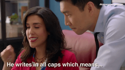
The context of where uppercase is used can help soften that feeling and instead offer it simply as a stronger form for a call to action. However, the base personality of your text is going to come from the choice of typeface, which are broken down into three main categories. Here are some examples of fonts within those categories, what their personality might look like, and where it is best used on your site. The first two examples in each image will be typefaces that you are more likely to be familiar with, and the last two will be good examples of usable typefaces for the web.
Serifs

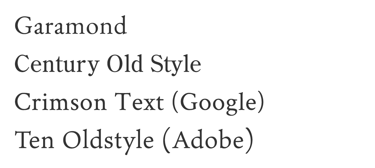
- Old-style
Personality: Traditional, trustworthy, old-fashioned
Great for: Headings and body text
- Transitional
Personality: Grounded, adaptable, vintage
Great for: Headings and body text

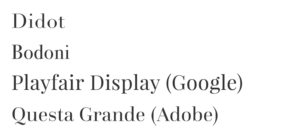
- Didone
Personality: Modern, fashionable, luxurious
Great for: Large headings and accents


- Slab serif
Personality: Rural, down-to-earth, relatable
Great for: Headings and accents
Sans-serifs

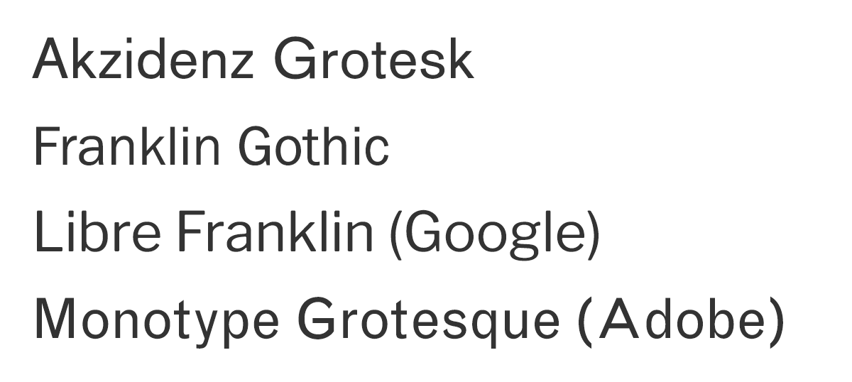
- Grotesque
Personality: Straight-forward, a little different, intelligent
Great for: Headings and body text

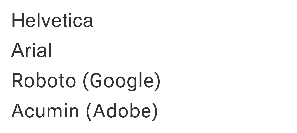
- Neo-grotesque
Personality: Efficient, direct, accessible
Great for: Headings and body text

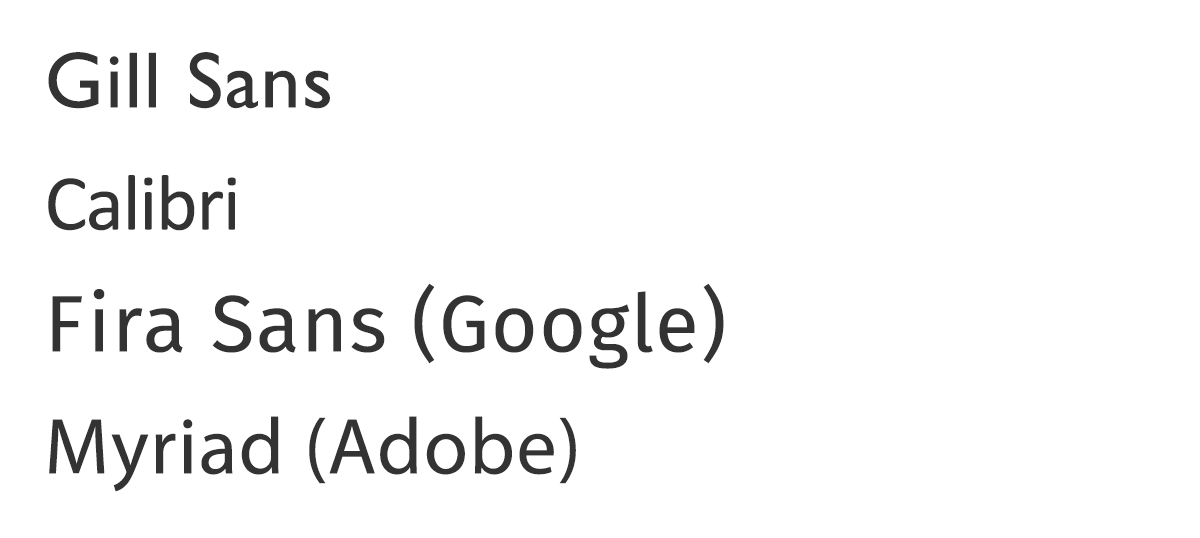
- Humanist
Personality: Fun, forward-thinking, easy-going
Great for: Body text


- Geometric
Personality: Unique, modern, artistic
Great for: Headings and accents
Scripts

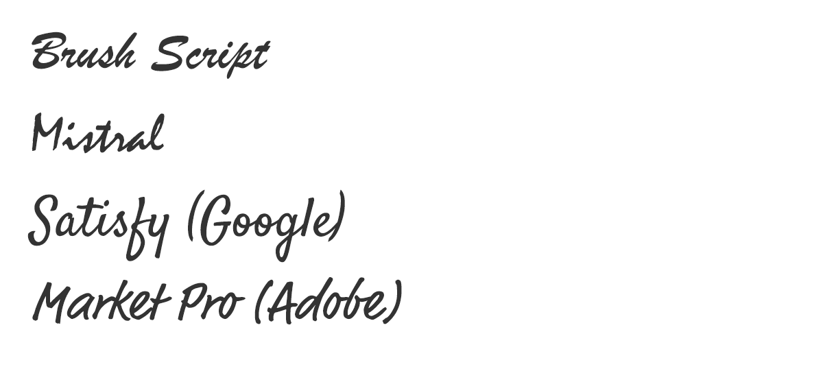
- Handwritten / Casual
Personality: Personable, friendly, comfortable
Great for: Accents

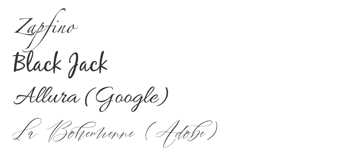
- Calligraphic / Formal
Personality: Luxurious, high-end, elegant
Great for: Accents
Files & Licensing
This is where the biggest difference between print and digital typography lies, and for good reason since they are different applications of a typeface. You may have only needed to use what is available on your computer for things like letters and the usual business needs. On the Internet, a “webfont license” is required, and it is not always included with what you can download and use on your own computer in programs like Microsoft Word. To make it even more confusing, other software like Canva have licensed fonts that aren’t available on other widely-available systems, which can make it difficult to keep a consistent brand across materials.
There is a small base of global fonts that everyone’s computer is able to show. These are the originals: fonts that were made at the beginning of Internet usage and simply provided to you on your computer by default. They are not ideal to rely on for your main typeface because their clarity hasn’t been updated and their personalities are overdone, but they are good to have in your fontstack* just in case the other ones don’t work out for some reason. This list of “web safe” fonts include ones you may be most familiar with, such as Times New Roman, Helvetica, Arial, Tahoma, Trebuchet MS, Verdana and Georgia. A very high percentage of computers have these fonts installed by default so they are “safer” options to have as backups for your selections. But what’s so different about the newer fonts?
When you are choosing a font, make sure that whatever you choose at least has an alternative available for your website.
Many of the fonts that you’ll want to use were designed more recently, and specifically for being read on a screen. That might just mean that the way the shapes were created made it easier to be displayed through the little dots of light that make up whatever screen you’re viewing it on, but it can also mean the technical aspect of how it is loaded and used has been modernized, such as giving you more smooth variability or flexibility in size and width. They are also going to have the widest range of personality and uniqueness to them, making it easier to match to your own brand and self. However, because they are not included on your computer by default, it means it has to be loaded in from somewhere ― and most places charge a fee for the hosting and accessibility if you don’t have a server to host it on yourself. Google Fonts is a great free resource!
When you are choosing a font, depending on if you are starting with your website or your overall identity, you’ll want to make sure that whatever you choose at least has an alternative available for your website.
*A fontstack is a list of fonts that you tell the browser to use in order of appearance. It is good to have at least two in it: this helps make sure all browsers and operating systems have something that is a bit more unique to work with that fits your brand, especially if your main font is hosted on a server that may change in the future. For example, for your body text you might have this as a fontstack:
Open Sans, Helvetica, Arial, sans-serif;
(Open Sans is a Google Font ― Helvetica is found on Mac and some PCs ― Arial is found on PCs and Mac ― sans-serif is the universal font type available on everything)
The Google font will be the most widely available and closest match to your own font or style. Putting it first means it is what the browser will try to show your text as first. The middle fonts are there as backups ― they will give more personality than the base file for your font type, and ensure availability for anyone that could be viewing your site just in case the Google server does not respond to show Open Sans. The last one is the globally available font which should match the general type you were using, sans-serif in this case.
Pick your Pairing
Here are some example font pairings you can use on your website, with code provided for RealtyNinja websites in particular. Paste the code given for each pair into your Custom CSS Styles box under your Custom Code Settings and then save the page. That’s it, you’re done! If you are a RealtyNinja customer, contact our support team if you need help making these changes.
Spartan & Cabin

@import url('https://fonts.googleapis.com/css2?family=Cabin&family=Spartan:wght@400;600&display=swap');
.header1, .header2, .header3, .header4, .header5, h1, h2, h3, h4, h5, .recent-blog-entry-date, .header-contact-details, .navbar-default .navbar-nav>li>a, .hero-carousel .carousel-caption h1, .section-heading h3, .listing-main-info h1, .blog-header-title-section .blog-entry-info, .blog-header-title-section h1, .blog-overview-wrapper, .blog-overview-wrapper h2 {
font-family: 'Spartan',Helvetica,Arial,sans-serif;
}
h1, .header1 {
font-weight:600;
}
.header2, .header3, .header4, .header5, h2, h3, h4, h5 {
font-weight:400;
}
body, .big-contact-form-wrapper, .small-contact-info-wrapper, .hero-carousel .carousel-caption .btn, .building-main-info-listings-count, .listing-detail-info-list-container, .listing-grid, .listing-list, .listing-main-info-price, .listing-secondary-info, .mls-search-controls-wrapper, .mls-search-controls-wrapper label, .search-results-table-view-wrapper, #footer-disclaimer, .recent-blog-entry-text, .blog-post-content .header1, .blog-post-content .header2, .blog-post-content .header3, .blog-post-content .header4, .blog-post-content .header5, .blog-post-content h1, .blog-post-content h2, .blog-post-content h3, .blog-post-content h4, .blog-post-content h5, .blog-header-title-section .blog-entry-info, .blog-post-content, .blog-overview-wrapper, .blog-overview-wrapper h2, .mls-search-controls-wrapper .form-control {
font-family: 'Cabin',Helvetica,Arial,sans-serif;
}
Poppins & Piazzolla

@import url('https://fonts.googleapis.com/css2?family=Piazzolla:wght@300&family=Poppins:wght@300;600&display=swap');
.header1, .header2, .header3, .header4, .header5, h1, h2, h3, h4, h5, .recent-blog-entry-date, .header-contact-details, .navbar-default .navbar-nav>li>a, .hero-carousel .carousel-caption h1, .section-heading h3, .listing-main-info h1, .blog-header-title-section .blog-entry-info, .blog-header-title-section h1, .blog-overview-wrapper, .blog-overview-wrapper h2 {
font-family: 'Poppins',Helvetica,Arial,sans-serif;
}
h1, .header1 {
font-weight:300;
}
.header2, .header3, .header4, .header5, h2, h3, h4, h5 {
font-weight:600;
}
body, .big-contact-form-wrapper, .small-contact-info-wrapper, .hero-carousel .carousel-caption .btn, .building-main-info-listings-count, .listing-detail-info-list-container, .listing-grid, .listing-list, .listing-main-info-price, .listing-secondary-info, .mls-search-controls-wrapper, .mls-search-controls-wrapper label, .search-results-table-view-wrapper, #footer-disclaimer, .recent-blog-entry-text, .blog-post-content .header1, .blog-post-content .header2, .blog-post-content .header3, .blog-post-content .header4, .blog-post-content .header5, .blog-post-content h1, .blog-post-content h2, .blog-post-content h3, .blog-post-content h4, .blog-post-content h5, .blog-header-title-section .blog-entry-info, .blog-post-content, .blog-overview-wrapper, .blog-overview-wrapper h2, .mls-search-controls-wrapper .form-control {
font-family: 'Piazzolla',Times,serif;
}
Tenor Sans & Assistant
@import url('https://fonts.googleapis.com/css2?family=Assistant:wght@300&family=Tenor+Sans&display=swap');
.header1, .header2, .header3, .header4, .header5, h1, h2, h3, h4, h5, .recent-blog-entry-date, .header-contact-details, .navbar-default .navbar-nav>li>a, .hero-carousel .carousel-caption h1, .section-heading h3, .listing-main-info h1, .blog-header-title-section .blog-entry-info, .blog-header-title-section h1, .blog-overview-wrapper, .blog-overview-wrapper h2 {
font-family: 'Tenor Sans',Helvetica,Arial,sans-serif;
}
h1, .header1, .header2, .header3, .header4, .header5, h2, h3, h4, h5 {
font-weight:300;
}
body, .big-contact-form-wrapper, .small-contact-info-wrapper, .hero-carousel .carousel-caption .btn, .building-main-info-listings-count, .listing-detail-info-list-container, .listing-grid, .listing-list, .listing-main-info-price, .listing-secondary-info, .mls-search-controls-wrapper, .mls-search-controls-wrapper label, .search-results-table-view-wrapper, #footer-disclaimer, .recent-blog-entry-text, .blog-post-content .header1, .blog-post-content .header2, .blog-post-content .header3, .blog-post-content .header4, .blog-post-content .header5, .blog-post-content h1, .blog-post-content h2, .blog-post-content h3, .blog-post-content h4, .blog-post-content h5, .blog-header-title-section .blog-entry-info, .blog-post-content, .blog-overview-wrapper, .blog-overview-wrapper h2, .mls-search-controls-wrapper .form-control {
font-family: 'Assistant',Helvetica,Arial,sans-serif;
}
Freight & Arboria
@import url("https://use.typekit.net/cah7ves.css");
.header1, .header2, .header3, .header4, .header5, h1, h2, h3, h4, h5, .recent-blog-entry-date, .header-contact-details, .navbar-default .navbar-nav>li>a, .hero-carousel .carousel-caption h1, .section-heading h3, .listing-main-info h1, .blog-header-title-section .blog-entry-info, .blog-header-title-section h1, .blog-overview-wrapper, .blog-overview-wrapper h2 {
  font-family: freight-big-pro,Baskerville,Times,serif;
}
body, .big-contact-form-wrapper, .small-contact-info-wrapper, .hero-carousel .carousel-caption .btn, .building-main-info-listings-count, .listing-detail-info-list-container, .listing-grid, .listing-list, .listing-main-info-price, .listing-secondary-info, .mls-search-controls-wrapper, .mls-search-controls-wrapper label, .search-results-table-view-wrapper, #footer-disclaimer, .recent-blog-entry-text, .blog-post-content .header1, .blog-post-content .header2, .blog-post-content .header3, .blog-post-content .header4, .blog-post-content .header5, .blog-post-content h1, .blog-post-content h2, .blog-post-content h3, .blog-post-content h4, .blog-post-content h5, .blog-header-title-section .blog-entry-info, .blog-post-content, .blog-overview-wrapper, .blog-overview-wrapper h2, .mls-search-controls-wrapper .form-control {
  font-family: arboria,Helvetica,Arial,sans-serif;
}
Quiche Sans & Fieldwork
@import url("https://use.typekit.net/kdw2bda.css");
.header1, .header2, .header3, .header4, .header5, h1, h2, h3, h4, h5, .recent-blog-entry-date, .header-contact-details, .navbar-default .navbar-nav>li>a, .hero-carousel .carousel-caption h1, .section-heading h3, .listing-main-info h1, .blog-header-title-section .blog-entry-info, .blog-header-title-section h1, .blog-overview-wrapper, .blog-overview-wrapper h2 {
  font-family: quiche-sans,Helvetica,Arial,sans-serif;
}
h1, .header1, .header2, .header3, .header4, .header5, h2, h3, h4, h5 {
  font-weight:400;
}
body, .big-contact-form-wrapper, .small-contact-info-wrapper, .hero-carousel .carousel-caption .btn, .building-main-info-listings-count, .listing-detail-info-list-container, .listing-grid, .listing-list, .listing-main-info-price, .listing-secondary-info, .mls-search-controls-wrapper, .mls-search-controls-wrapper label, .search-results-table-view-wrapper, #footer-disclaimer, .recent-blog-entry-text, .blog-post-content .header1, .blog-post-content .header2, .blog-post-content .header3, .blog-post-content .header4, .blog-post-content .header5, .blog-post-content h1, .blog-post-content h2, .blog-post-content h3, .blog-post-content h4, .blog-post-content h5, .blog-header-title-section .blog-entry-info, .blog-post-content, .blog-overview-wrapper, .blog-overview-wrapper h2, .mls-search-controls-wrapper .form-control {
  font-family: fieldwork,Helvetica,Arial,sans-serif;
}
Liana & Liberation Serif

@import url("https://use.typekit.net/wpl3tct.css");
.header1, h1, .recent-blog-entry-date, .header-contact-details, .navbar-default .navbar-nav>li>a, .hero-carousel .carousel-caption h1, .section-heading h3, .listing-main-info h1, .blog-header-title-section .blog-entry-info, .blog-header-title-section h1, .blog-overview-wrapper, .blog-overview-wrapper h2 {
  font-family: liana,cursive;
}
body, .header2, .header3, .header4, .header5, h2, h3, h4, h5, .big-contact-form-wrapper, .small-contact-info-wrapper, .hero-carousel .carousel-caption .btn, .building-main-info-listings-count, .listing-detail-info-list-container, .listing-grid, .listing-list, .listing-main-info-price, .listing-secondary-info, .mls-search-controls-wrapper, .mls-search-controls-wrapper label, .search-results-table-view-wrapper, #footer-disclaimer, .recent-blog-entry-text, .blog-post-content .header1, .blog-post-content .header2, .blog-post-content .header3, .blog-post-content .header4, .blog-post-content .header5, .blog-post-content h1, .blog-post-content h2, .blog-post-content h3, .blog-post-content h4, .blog-post-content h5, .blog-header-title-section .blog-entry-info, .blog-post-content, .blog-overview-wrapper, .blog-overview-wrapper h2, .mls-search-controls-wrapper .form-control {
  font-family: liberation-serif,Times,serif;
}
You don’t need to re-design your entire website to give it a fresh feeling. Even a small change to the typography of your site is a great way to upgrade the design. Have some fun playing around with what feels best to you ― go ahead and brag that you’re a type nerd now!
Reminder: Enjoy 20% Off All Semi-custom Designs for November 2021!