These days, there are so many little details to consider when building your website. Some things are content related, where others are totally technical. One of these technical considerations is the ability to view your website on a variety of mobile devices. The way you view a website on an iPhone greatly differs from the way it’s viewed on an HTC Touch, or Samsung Galaxy Phone; and completely differs from the way it’s viewed on a tablet. The term that is commonly used with regards to websites that are automatically reformatted to fit their landscape is “responsive”. Responsive website designs will shift and mold to fit their surroundings, whether it’s a 25 inch computer monitor, or a 640X1136 iPhone 5 screen.
The Good News for RealtyNinja Clients: All RealtyNinja REALTOR® website customers automatically receive a dedicated, responsive mobile website for no additional cost. To see what it looks like, just visit our sample website (www.realtyninjademo.com) on your smart phone. Our system auto-detects what device the user is browing the website on, and shows them a mobile-specific version of your website.

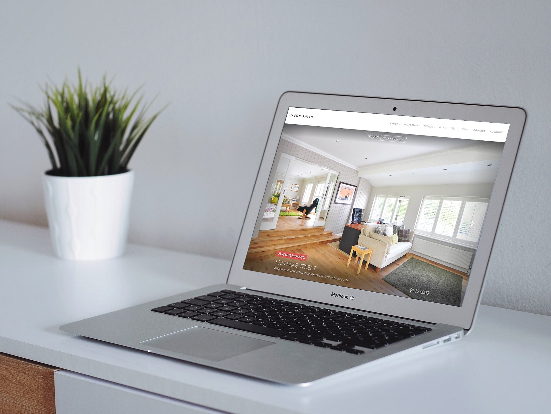
Our responsive website theme Shinobi shown above: https://www.realtyninja.com/shinobi-theme
Find out more about RealtyNinja’s Awesome Websites for Busy Real Estate Agents, Take the tour today: https://www.realtyninja.com/tour