
When a user loads up your website on their smart phone, we automatically detect that and send them to a dedicated mobile version of your website.
For example, if your website is “bobrealty.com” we send mobile users to “m.bobrealty.com” which feels like an actual app to the user. It’s limited in functionality and design on purpose and made to load super quickly. This is to keep things as simple as possible and ensure the user has a great experience navigating the site with speed and ease. We don’t include ALL the pages from your full site onto this mobile version, as it’s meant to be more of a “on-the-go” experience.
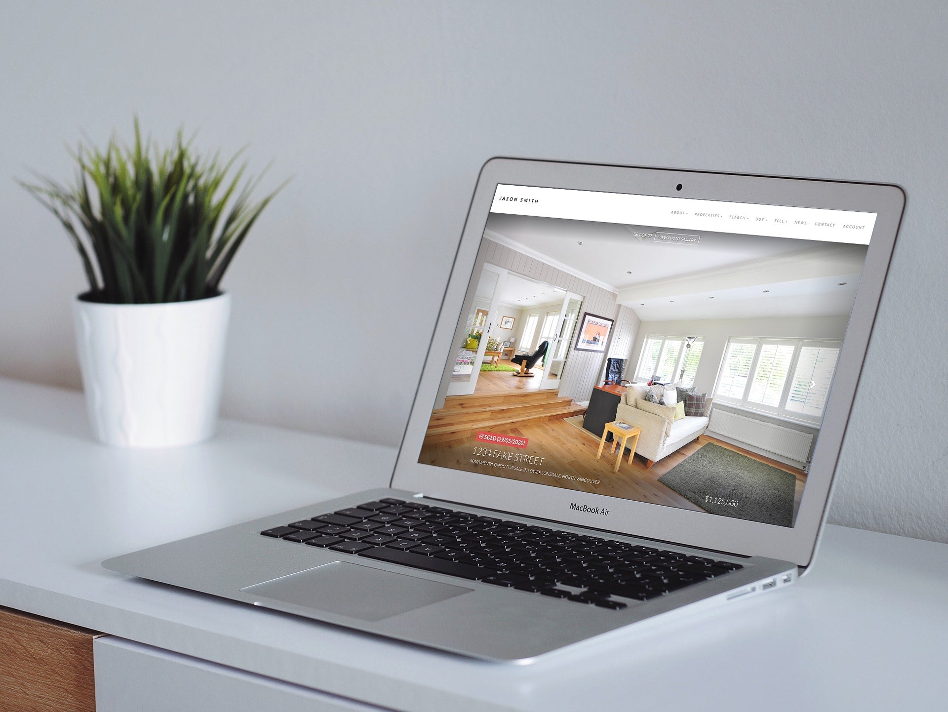
Our newer responsive themes (such as Shinobi) scale down nicely from a large monitor to a smart phone (horizontal and vertical orientation) and some people prefer to completely disable the dedicated mobile site entirely and just rely on the scaled-down version of their website. This is great for people that want to include absolutely everything they’ve added to their website on both desktop and smartphone sizes of their site. It’s also good for retaining any customized design or branding work you’ve created, as all that is kept in-tact when its scaled down. The downside is that your mobile users may get overwhelmed by all the content, when most of them are just trying to do a search, look at your listings or get a hold of you.
So what’s better?
It’s totally up to you which version you wish to use and both are great options.
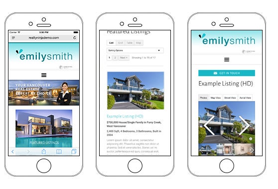
The dedicated mobile sites only show your banner, about page, listings, buildings, MLS searches, blog post and contact info.. and based on the numbers, that’s where most of your website visitors spend their time. We find that experience to be quicker and more suitable for most people using a smart phone to quickly browse your site.
If you have put a ton of effort into custom content pages, guides, testimonials, custom design work, etc. then you may prefer the scaled-down version of your full site which provides a more comprehensive experience for your website visitors.
Here’s a screenshot of the dedicated mobile website for realtyninjademo.com:

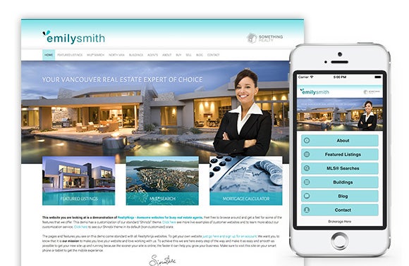
And for comparison, here’s the scaled-down version of the full site (with the dedicated mobile site turned OFF):
You’ll notice that in the example above, the scaled-down version has the same overall design and content as the desktop version of the site.. just scaled down in size.
How to turn off the dedicated mobile site, and use the scaled-down version
If you’d like to turn off the dedicated mobile site completely (and you’re using a responsive theme such as Shinobi), just login to your website and click Settings > Mobile Site > then un-check “enable mobile website” and click APPLY CHANGES. Now test it out on your smartphone by visiting your website URL, you’ll notice that it no longer redirects to the “m.” version of your site.
Need Help?
If you need help deciding which to use, or would like our designers to tweak the way your scaled-down site looks.. just get in touch and we’ll do our best to help you.
You’re a few clicks away from having an awesome new website. Click here to start your free trial.